It’s been awhile since I’ve opened up the ol’ cellar door and let you awful, cruelly formed things out for a bit of exercise and stimulation, so I thought I’d make this occasion extra special and give you a little inside look into how I create some of the wonders you might have spied up through the cracks in the floorboards while fighting for your survival amongst the other ravenous horrors down there with ya!
You’re only up out of that stinking hell, what, once every month or so, so I could either feed you, or tell you a little bit about how that album cover I did for MC Frontalot came about. Â I could tell by the frenzied look in your eye, a look often mistaken for insanity brought on by starvation bordering on the cessation of all your life functions, you would settle for nothing less than even the tiniest bit of background on how that album cover got made, so that’s what you’ll get!
That delicious, drool-inducing aroma coming from the dining room? Â Oh, that’s just the feast I had whipped up for you guys, but fuck that nonsense! Â We have art to discuss! Â ONWARD!
As you maybe know, I did the album cover artwork for Frontalot’s album, Zero Day, and it made life just a little bit better for everyone that has ever been nice to me (If you watch the news you’d know that everyone that wasn’t nice to me is now dying of everything that kills you). Â Thing is, some people aren’t content with simply living in a world where there is no war or pain thanks to what I created, and they agonize over just how such a thing could come to be, how I of all people, I, a former prostitute turned artist, could have made something so beautiful.
I will tell you now.
To get the full experience of my tale, I want you to put on these 3-D glasses. Â No, I didn’t write this in 3-D, but it was converted in post to jack up the prices and make you clutch at your throbbing head and eyes throughout.
So it was last year’s San Diego Comicon, and I was trying to fall asleep at an hour that would make it relatively struggle-free to not sleep through the entire next day so as to not miss attending the convention. Â Must’ve been around 3 in the morning or so, and was tossing and turning and punching and berating my pillow in that way neighbors back home or in hotels find so charming that they think the police would enjoy experiencing as well. Â As I had not yet quite fallen asleep, I was awake enough to hear the rapping at my 30th floor window.
I leapt from the bed, naked as all, Â and threw the curtains aside with such force that Frontalot, hovering like that vampire boy in Salem’s Lot, screamed and screamed as if losing his mind. Â “PUT SOME CLOTHES ON!” he howled insensibly, and shrieked, swiping at the air as if trying to bat away the photons from entering his eyes. Â He fell from sight, and, commotion ended, I returned to comforting, pulsating gelatin I excrete in preparing a resting spot.
The next day, I dropped by Front’s booth at the con and inquired as to what the deal was with the late night visitation.
“What are you talking about?” he responded distractedly, signing a cd for a fan as he spoke to me.
“Last night.”
“Okay.”
“Last night at my hotel. Â What the hell was it about? Â Did you want something?”
“I was doing karaoke last night.”
“I mean late at night.”
“I don’t know what you’re talking about, Jhonen.”
“You were hovering 30 floors up, banging on my window and then you screamed and flew off.”
“Oh yeah! Â I wanted to ask you if you’d do the cover to my next CD.”
“Sure.”
And that was the start of it, pretty much.
I had done some album artwork before, for Mindless Self Indulgence, and this new thing wouldn’t be nearly as extensive as what I did for them, so it was more like a fun little diversion than anything. Â This would just be the front image and not the entire packaging.
Another thing that differed from working with MSI was that Front was a bit more involved in what the actual design would be. Â MSI gave me the go ahead to do whatever the hell I wanted, so long as it wasn’t horrible, and since everything I do is amazing, that worked out pretty well, I think. Â There were only a few emails back and forth between myself and Jimmy Urine, and then he came over to my shack under the bridge to view the mostly completed pieces. Â Before he swore never to return, he said the stuff was cool, and that was that. Â I thought it ironic that he’d be so repelled by the smell of his own namesake.
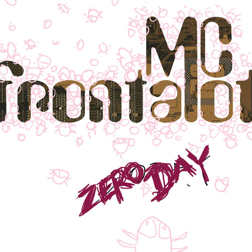
Front, however, was a bit closer to a concept, and, though vague, gave me enough to wonder just how his previous album covers came about. Â When prompted, he sent some doodles he had done for the artists he had worked with before.
You ever see those books or websites where some artist takes a child’s drawing and turns it into something much more elaborate and polished? Â Looking at Front’s sketch ideas alongside the artists’ completed pieces was something along those lines, with the original doodle having almost the entire idea there, only more raw and squiggly. Â I actually loved seeing those sketches and wondered if maybe he should do the cover himself.
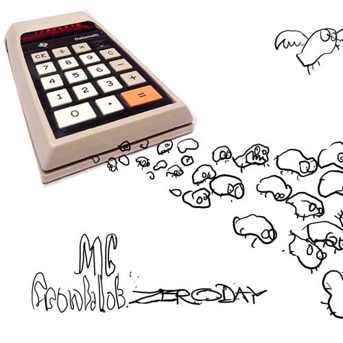
His basic idea for me was “some bugs coming out of a thing.” Â Not in those exact words, but just about. Â Zero Day was the theme, and so it was the basic idea of foul, gremliny critters pouring, crawling, pooping, or generally blasting out from some piece of gear, be it a calculator or old PC.
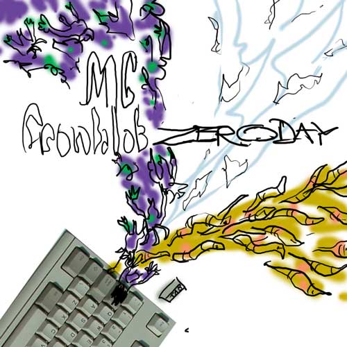
Here are the wee doodles Front sent me to illustrate what he was going for.
I actually love this one. Â It could easily be a finished cover image as it is!
This one’s just about the worst thing I’ve ever seen. Â I can’t believe this guy can fly.
And this is the one I found most fun for the imagination. Â The angle of the hardware made for a more dynamic stream of critters, and if there’s anything that gets me going, it’s critters streaming, blasting out of things into your face. Â It’s probably why I have all those sexual harassment suits going on these days.
As you can see, that last doodle is pretty much what ended up being the finished piece! Â Again, I thought that Front’s child-like scrawl was pretty damn cool looking for what he was going for, but he insisted on it looking amazing, and so I took over from there.
I go back and forth between doing things like this digitally and non-digitally. Â Like the MSI cover, this was a pretty typical mix of the two, with me penciling on paper, scanning, converting to a blue line, printing that out and inking on the blue line so only the black is scanned after the inks are done.
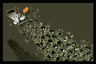
The only real big difference from my initial designs and the final piece is that I had originally placed a shadow farther down below the calc, as if the thing were flying above some indistinct surface below, but Front had a fear of heights, and wanted the calc more firmly rested, actually touching the surface, so as to lessen the appearance of the calculator flying so much as simply releasing the critters. Â He also wanted something to represent mankind’s endless struggle against ignorance, so I dropped in a gradient.
With the design finalized, in Photoshop, I scream at the keyboard until the spirits in my computer make everything look more or less like I want it, with the right colors here and there. Â In this case, I output a few color variants, and Front ended up going with the powdery blue palette that you see today on the album cover, billboards, tattooed on the side of pets and so on.
So that’s the story of how this particular thing happened. Â Neat, huh?
And here’s a wee peek at the revised version I did for an upcoming poster. Â I extended the format so as to allow for more bugs, and went back to the flying calculator with the distant drop shadow, because I’m stubborn.
I hope you learned as much as I did throughout this whole process, and I hope it gives you something to think about as you spend the next few months back in that sweltering nightmare hole. Â Yep, get on back in there now. Â You heard me.
